Strategic Advertisement Campaign
Impact
Within just one month, the marketing materials I designed contributed to an increase of 100 new appointments, showcasing the direct impact of effective visual communication. This success reflects how well-executed design can enhance office visibility and build patient trust.
Problem
Our radiology office, located in the basement of a busy medical center, lacked sufficient visibility. Despite being operational for three years, many patients still didn’t know we offered radiology services. This issue arose from a lack of marketing and clear signage, as the area is not heavily trafficked. Without direct guidance, patients were unable to discover the office on their own.
Solution
As Office Manager, I took the initiative to address this issue by designing a series of bilingual marketing materials that captured the professional and empathetic essence of our office. Through informational flyers, a banner, and a brochure for Breast Cancer Awareness Month, I created a visually appealing and easy-to-understand solution that would guide patients to our services.
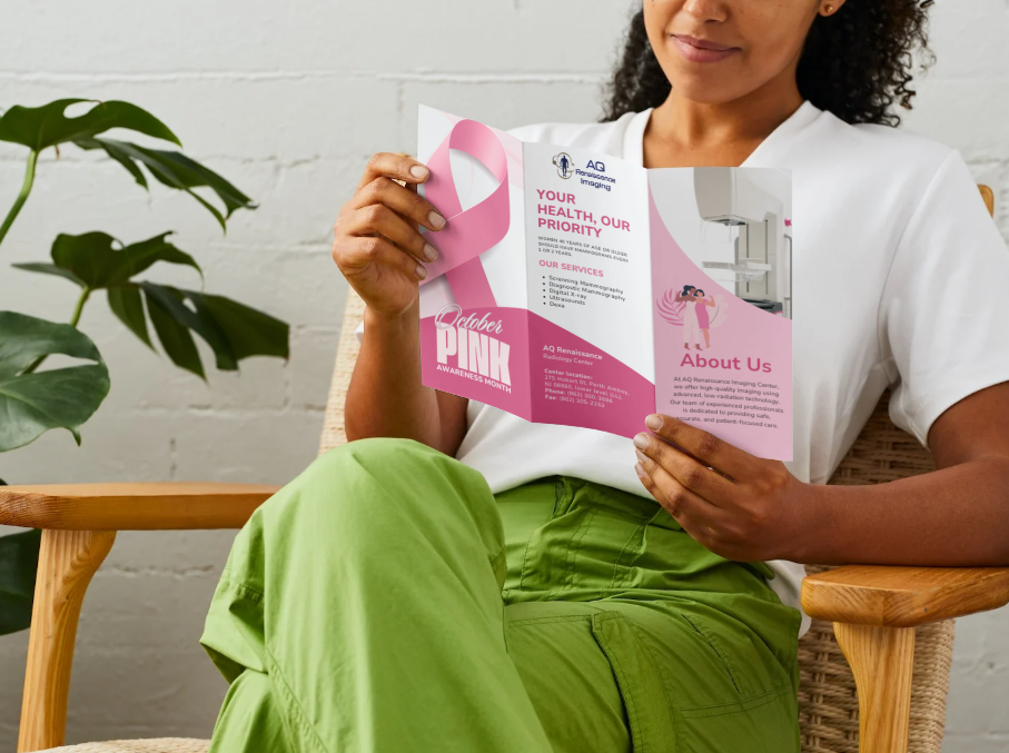
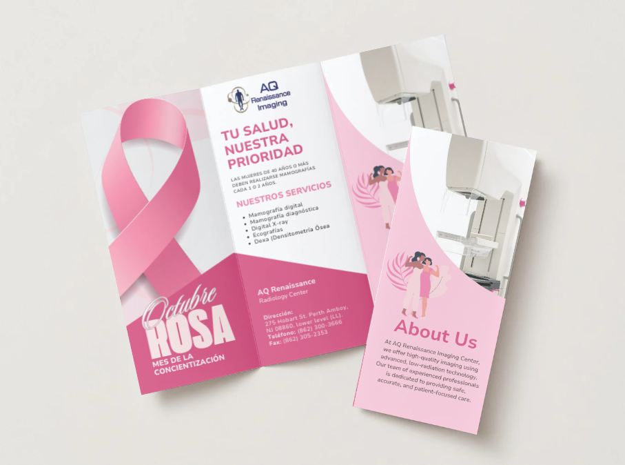
Tri-Fold Brochure for Breast Cancer Awareness Day 2025
Flyer
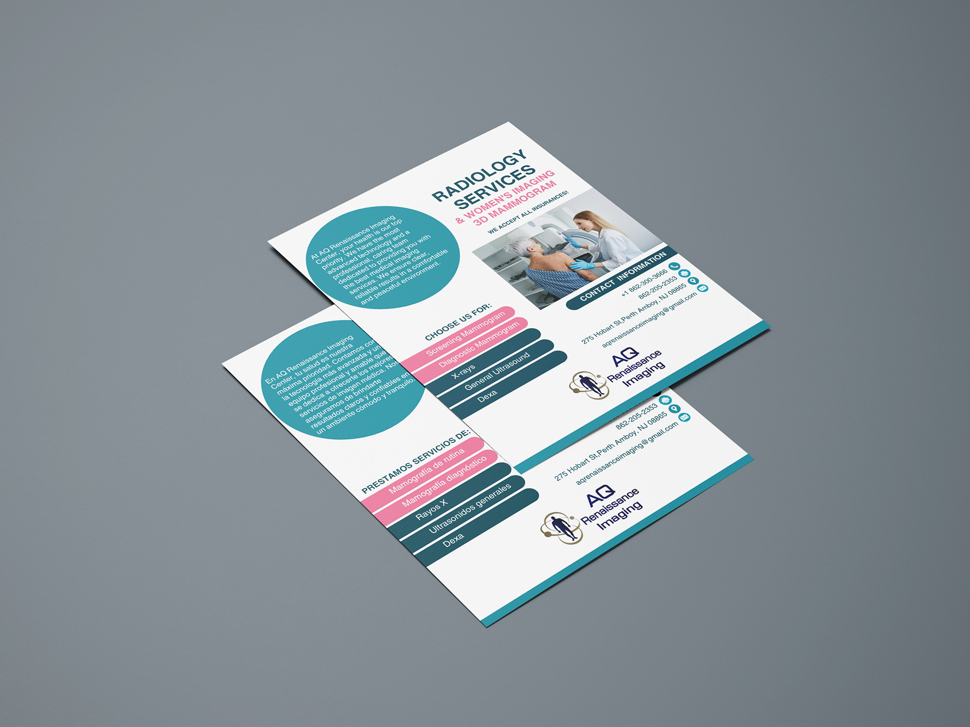
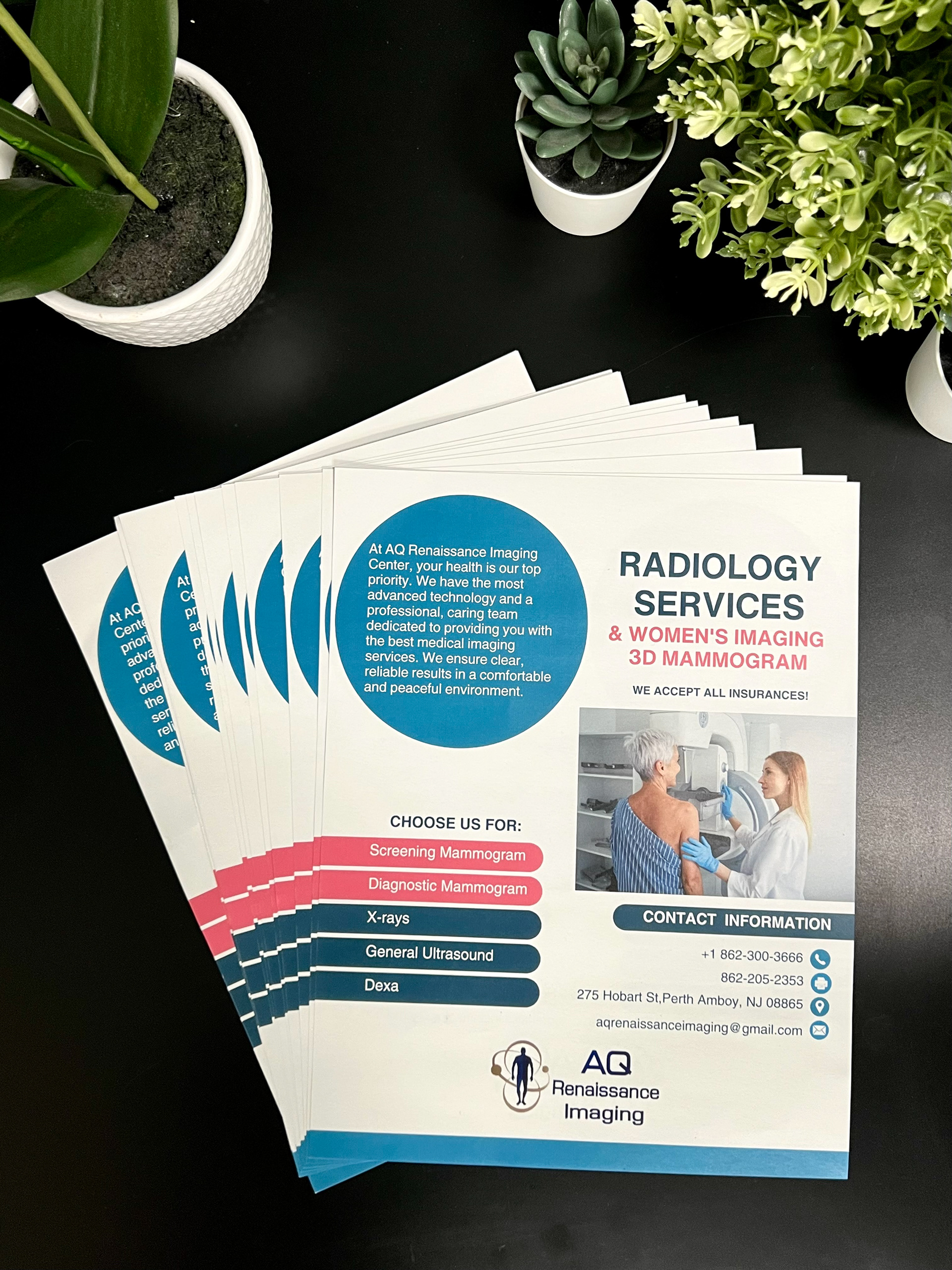
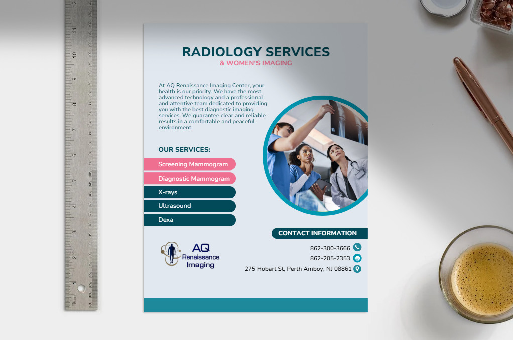
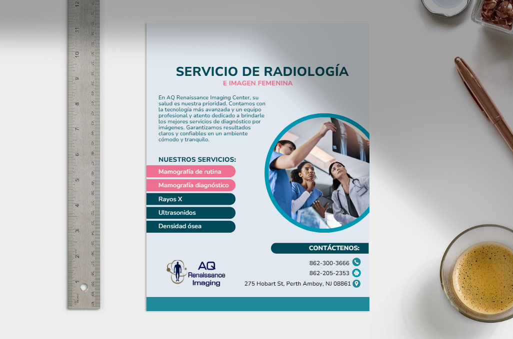
Created bilingual flyers to clearly present our radiology services, including mammograms and bone density scans. These flyers were distributed throughout the entire medical center to ensure maximum reach. Given that our major community consists of adults and elderly patients, the design was kept as simple and straightforward as possible, with clear typography and a structured layout for easy readability and accessibility.
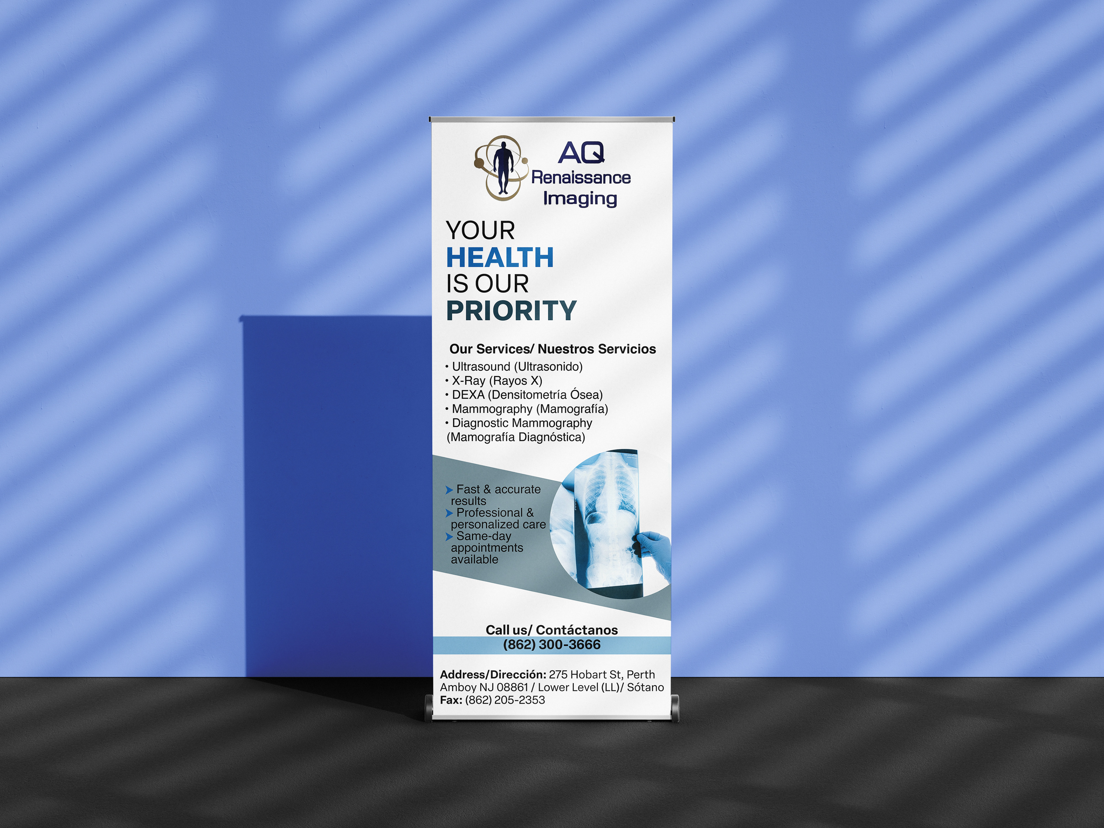
Banner
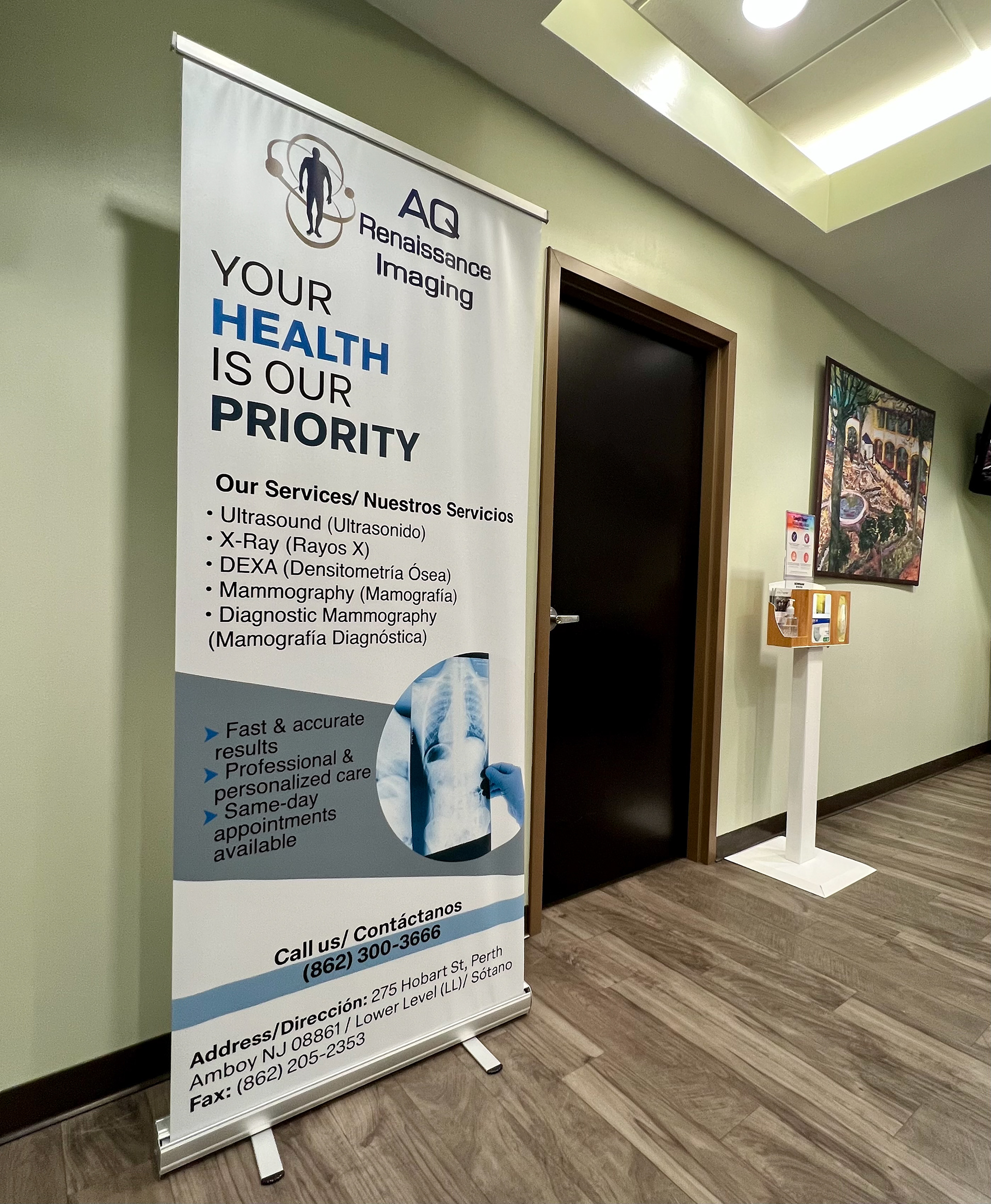
Designed a large, high-visibility banner strategically placed at the building's entrance to significantly enhance the visibility of our radiology office. The goal was to attract and guide patients towards our location, ensuring they could easily access our services. The design utilized bold typography and concise messaging to capture attention and provide clear directions, encouraging patients to visit our office in the basement.
Tri-Fold Brochure for Breast Cancer Awareness Day 2024
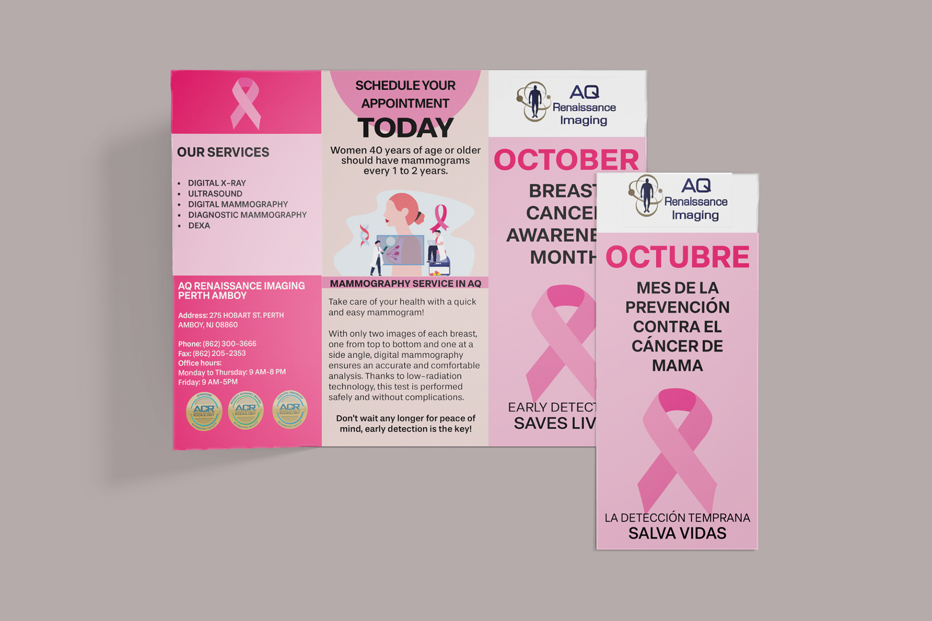
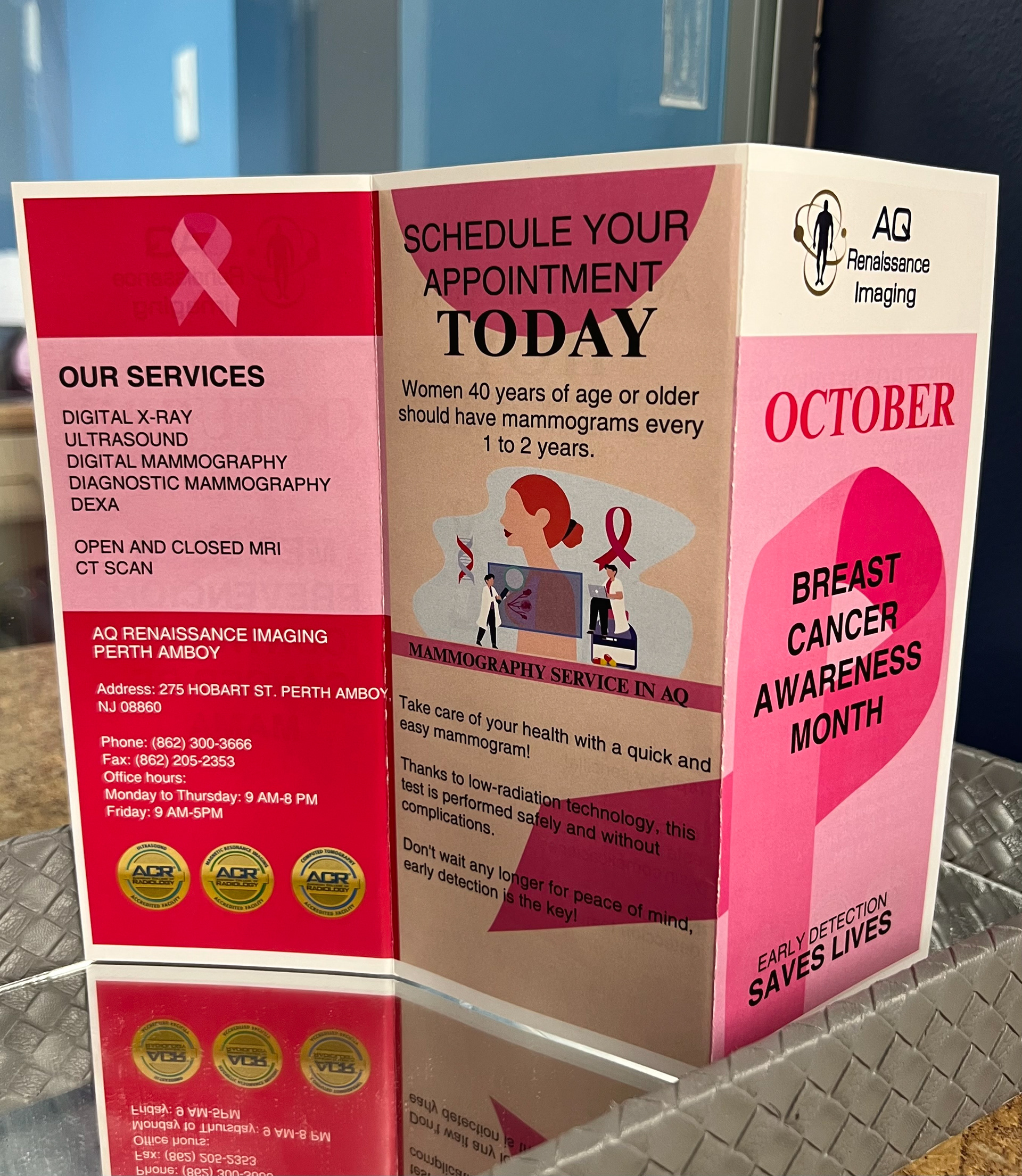
Designed a compact brochure for Breast Cancer Awareness Month, using pink tones to align with awareness campaigns. The brochure highlighted key preventive health information and our mammogram services, with a clear, structured layout to ensure easy readability and facilitate appointment scheduling.
For this campaign, I designed both a flyer and a tri-fold brochure with a focus on clarity and simplicity. The flyer presents all services in a clean, easy-to-understand way, while the brochure is dedicated to breast cancer awareness.
I experimented with typography to create a visual rhythm while maintaining readability and ensured graphic consistency between this year’s flyer and the overall campaign. The design emphasizes empathy, accessibility, and coherence, strengthening the campaign’s visual identity while keeping the message impactful and approachable.
Marketing Materials in Action