Visual Identity
Bogotá, Colombia
Mazeta was born as a family project with a deep artistic value inherited from our grandmother in Bogotá, Colombia. As a family, we sought to embark on a journey that would bring our art to life, creating pieces that share our essence and a touch of our magic with Colombian homes.
At first, the path wasn’t clear, but we soon discovered that what truly inspires us and moves our hearts is creating unique artistic projects—pieces that bring harmony to home décor and allow people to feel connected to them.
This is how we realized the brand needed to reflect its true essence: elegance, warmth, and love, expressed in a sophisticated way that would help us position ourselves in the market and build trust with our customers.
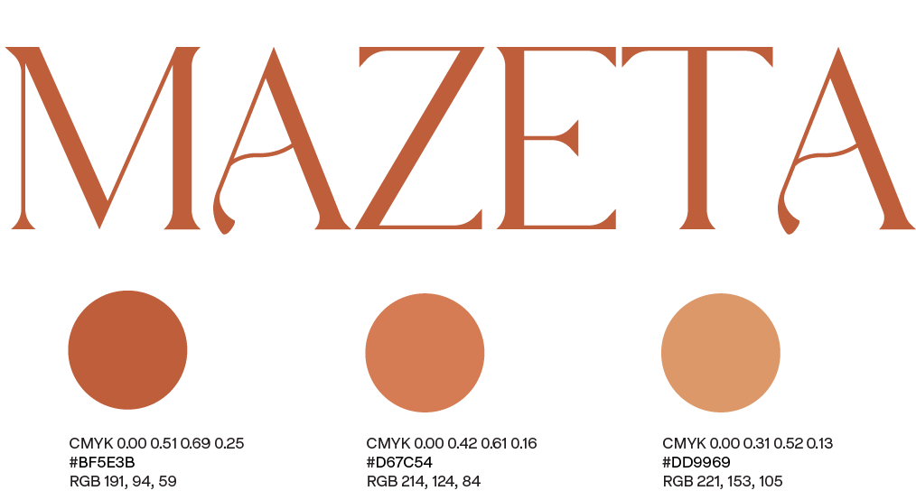
I rolled up my sleeves to bring our visual identity to life. I started by exploring a warm color palette that would capture the heart of our values. Then came the logo—a journey of finding the perfect balance between sophistication and subtle elegance. Each choice, every detail, was a step closer to giving our brand a personality that could tell its story. From that logo, the rest of Mazeta’s visual world began to unfold, piece by piece, shaping the identity we are proud to share.
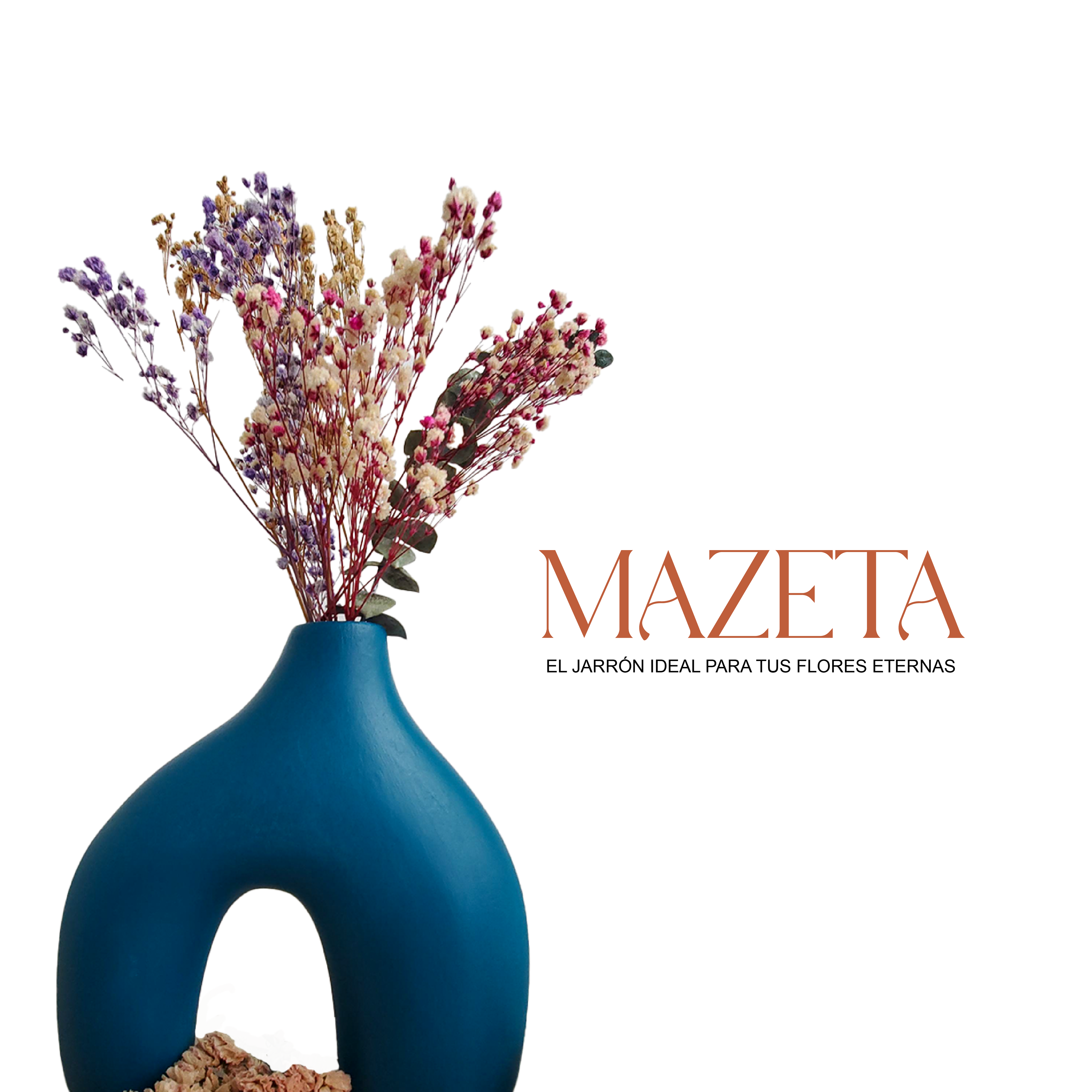
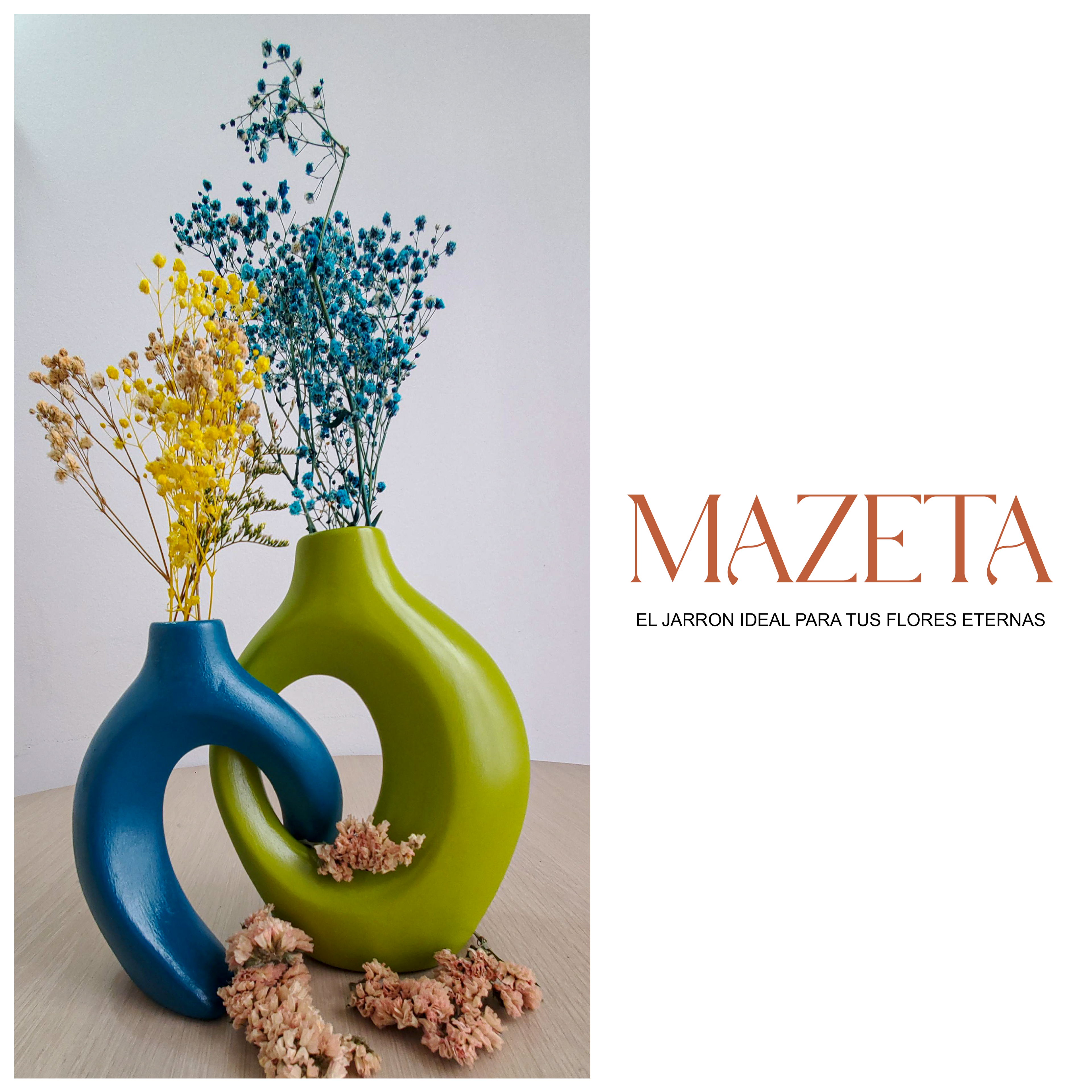
Next, I decided to play with visual elements that could be used for social media posts we will create in the future.
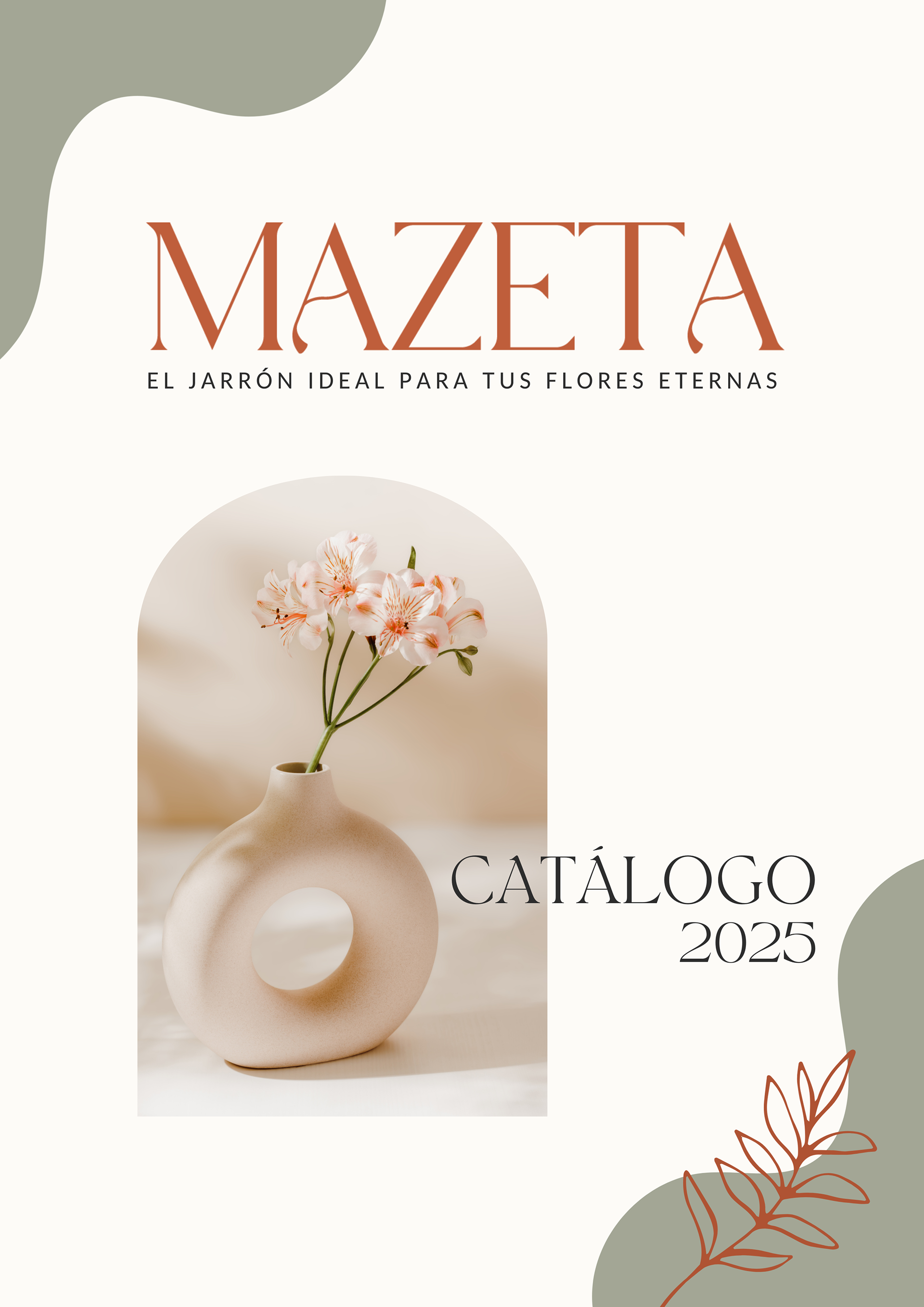
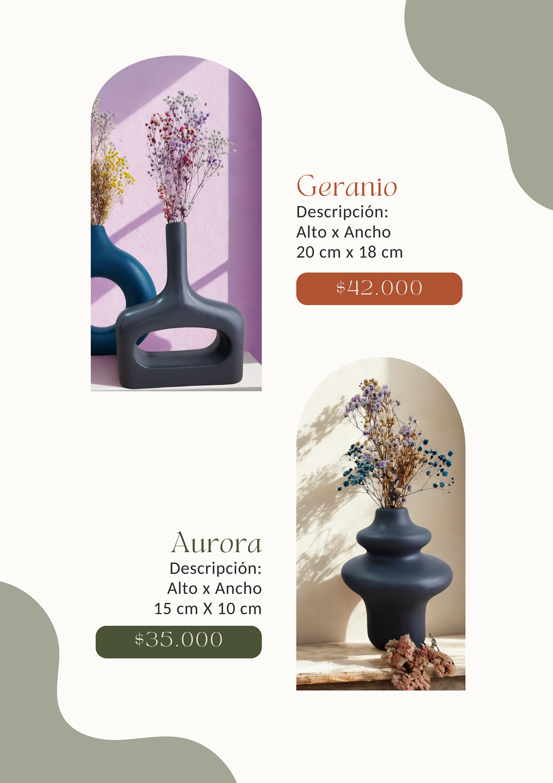
The catalog I created in 2024 features a light, rocky-textured background, giving an elegant and natural frame to the content. It includes the artist’s story, photos of the pieces, and their prices, all organized in a visually appealing way. The color palette is wide and vibrant, reflecting the diversity of the brand, and it was designed as a PDF to make it easy to share with clients.
Fall 2025 Collection
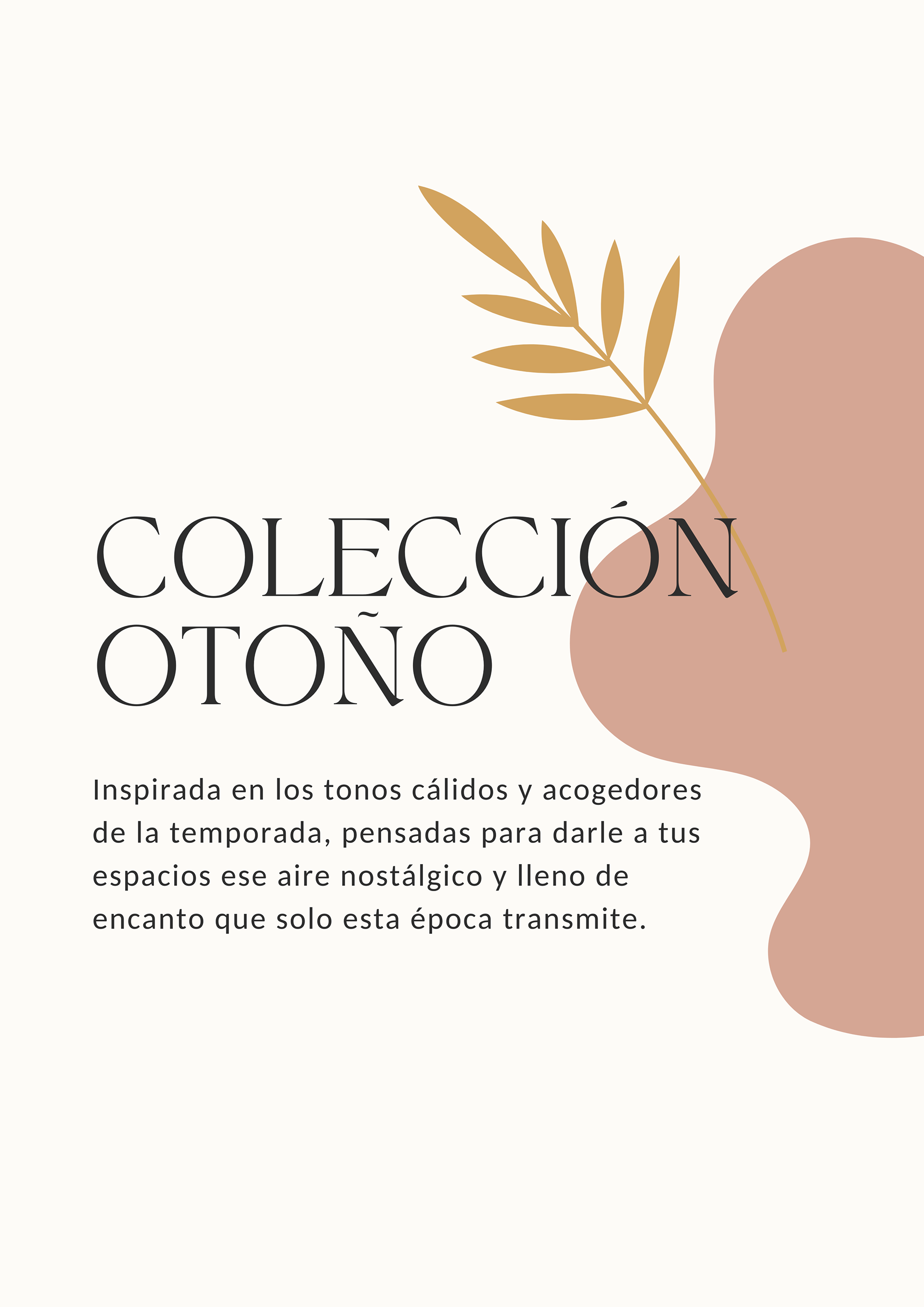
This catalog is inspired by the warm, cozy colors of autumn—golden hues, terracotta, deep greens, and reddish tones. Each piece reflects elegance and harmony, inviting clients to bring a unique touch of beauty and warmth to their homes.